Your event deserves better than AI slop.
Upload the poster you hate or tell us about your event. We’ll turn it into something people might actually put on a wall.
A free creative experiment, made for fun. Please check every detail before publishing or printing.
No design skills. No font crimes. Print-ready A2 artwork.
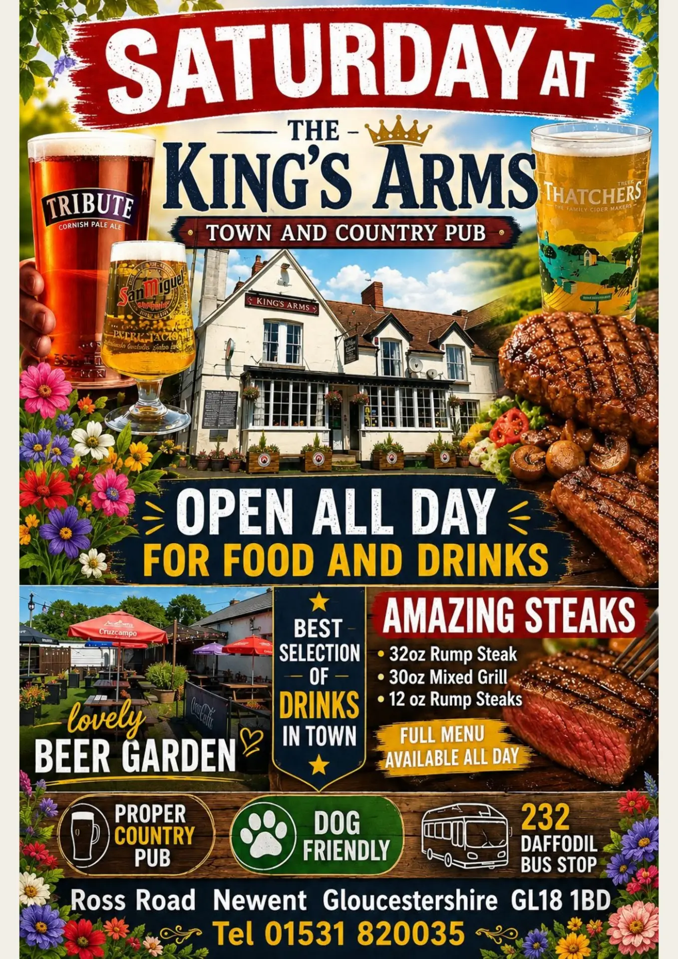
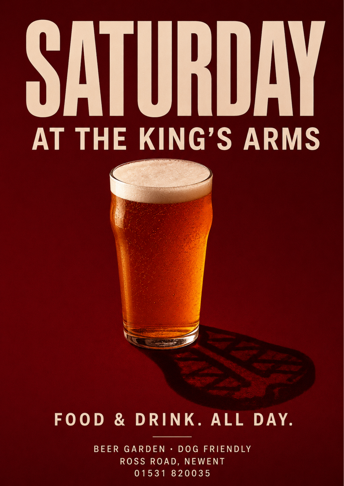
Drag the handle, or focus the slider and use the arrow keys.
Same event. One clear idea.
We don’t tidy bad posters. We reconsider them.
01
Rescue a poster
Upload the existing design. We’ll extract the facts, remove the clutter and find the poster hiding inside it.
Upload the horror02
Start with words
Give us the event name, date, time and a few key details. We’ll develop the idea and build the poster.
Tell us about itOne image.
One message.
One idea.
Great design is not always minimal. It is always deliberate. Every element should strengthen the same idea, establish a clear reading order or help someone act. Everything else can go.
The UnSlop creative constitution
How it works
01
Give us the truth
Upload the existing poster or provide the essential event information.
02
We find the idea
UnSlop identifies the proposition, strips away the filler and develops one dominant creative concept.
03
Download the artwork
Receive a print-ready A2 poster with accurate typography, bleed and high-resolution artwork.
Built for the wall, not just the feed.
- Format
- A2 print-ready PDF
- Size
- 420 × 594 mm
- Resolution
- 300ppi artwork
- Bleed
- 3mm
- Also supplied
- High-resolution PNG
- Typography
- Accurate editable information
- Scaling
- Automatic A3 and A4 versions
- Later
- Social formats coming later
Recently unslopped
See all examplesWhat makes a poster unslopped?
01
One dominant idea
The poster must be understandable as one sentence.
02
A clear reading order
The viewer should know what to look at first, second and third.
03
Visual metaphor before decoration
One clever object or collision is more memorable than twelve literal icons.
04
Information earns its place
Essential details stay. Supporting information moves online.
05
Nostalgia must be specific
Retro design should understand the chosen period rather than adding beige paper and scratches.
06
Typography remains accurate
Dates, prices, venues and URLs should never be left to an image generator.
07
Dense can still be disciplined
More text is allowed when it forms one coherent visual system.
If everything is shouting, nothing is being heard.